Quantifying.me (2014) A Year in a Chart
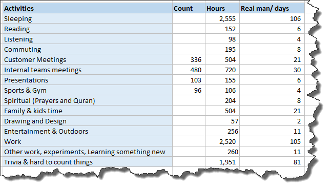
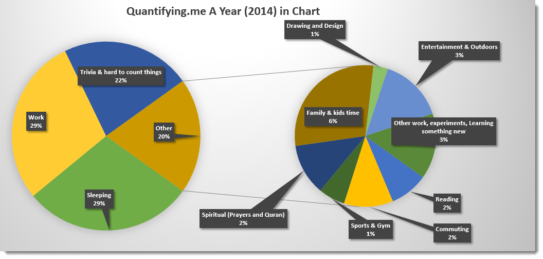
I like quantifying things and making them tangible. Time is the most precious asset any human can have. It is a good thing to track where is your time is invested (or wasted). “Quantifying.me” is a trial of measuring time spent. I am always tracking and measure things since you cannot improve anything you cannot measure it. Below is an attempt to diagnose my timing in a year. Below figures are collected and tracks using:
1- Outlook Calendar,
2- GoalTracker – Android Application,
3- The mighty Excel sheets.
I hope this experiment is helpful to inspire you doing the same and see how wonderful ways you spend your time and work on improving it.


Leave a Reply