The Battle between Fluid and Static Web Designs
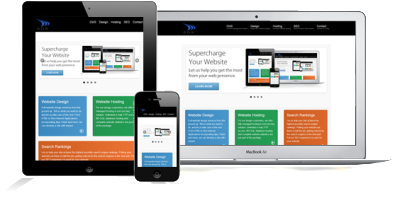
In this dynamic world, web pages should follow the same pace. With the huge number of web devices (ranging from desktops, notebooks, tablets, phablets, and smart phones), it became a crucial decision either to follow: Static or Fluid web design. This article explores briefly the subject along pros and cons of each choice.
When designing a website layout for a large audience, the designer must consider the following potential differences among visitors:
- Screen resolution,
- Browser choice,
- Whether or not the browser is maximized,
- Extra toolbars open in the browser (History, Bookmarks, etc.),
- Even the operating system and hardware.
1. Difference Between Fixed And Fluid Layouts
Although most designers and developers would consider defining fixed and fluid website layouts to be elementary, we’ll go over it just to be clear.
FIXED WEBSITE LAYOUTS
A fixed website layout has a wrapper that is a fixed width, and the components inside it have either percentage widths or fixed widths. The important thing is that the container (wrapper) element is set to not move. No matter what screen resolution the visitor has, he or she will see the same width as other visitors.
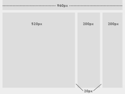
The image above shows the general outline of a fixed-width website layout. The components inside are fixed to 520, 200 and 200 pixels, respectively. A 960-pixel width has become the standard in modern Web design because most website users are assumed to browse in 1024×768 resolution or higher.
FLUID WEBSITE LAYOUTS
In a fluid website layout, also referred to as a liquid layout, the majority of the components inside have percentage widths, and thus adjust to the user’s screen resolution.
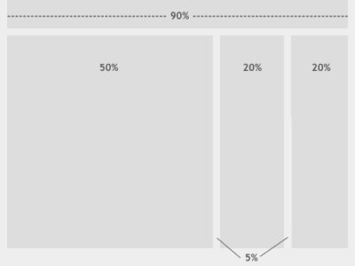
The image above shows a fluid (liquid) website layout. While some designers may give set widths to certain elements in fluid layouts, such as margins, the layout in general uses percentage widths so that the view is adjusted for each user.
2. Fixed Web Page Design
Many designers prefer fixed layouts to fluid ones because they’re easier to make and provide more assurance that what the designer sees, the user sees. However, the pros and cons come out even with fluid-layout design.
PROS
- Fixed-width layouts are much easier to use and easier to customize in terms of design.
- Widths are the same for every browser, so there is less hassle with images, forms, video and other content that are fixed-width.
- There is no need for min-width or max-width, which isn’t supported by every browser anyway.
- Even if a website is designed to be compatible with the smallest screen resolution, 800×600, the content will still be wide enough at a larger resolution to be easily legible.
CONS
- A fixed-width layout may create excessive white space for users with larger screen resolutions, thus upsetting “divine proportion,” the “Rule of Thirds,” overall balance and other design principles.
- Smaller screen resolutions may require a horizontal scroll bar, depending the fixed layout’s width.
- Seamless textures, patterns and image continuation are needed to accommodate those with larger resolutions.
- Fixed-width layouts generally have a lower overall score when it comes to usability.
3. Fluid Web Page Design
Designers may not use fluid page designs for various reasons, but the layout’s benefits are often overlooked. Below are pros and cons to think about when considering fluid web page design.
PROS
- Fluid web page design can be more user-friendly, because it adjusts to the user’s set up.
- The amount of extra white space is similar between all browsers and screen resolutions, which can be more visually appealing.
- If designed well, a fluid layout can eliminate horizontal scroll bars in smaller screen resolutions.
CONS
- The designer has less control over what the user sees and may overlook problems because the layout looks fine on their specific screen resolution.
- Images, video and other types of content with set widths may need to be set at multiple widths to accommodate different screen resolutions.
- With incredibly large screen resolutions, a lack of content may create excess white space that can diminish aesthetic appeal.
4. Elastic Design
There is a third option when working with Web page layouts. An elastic design is sometimes preferred by designers because it mixes the two other main layout types. It works by sizing all elements with em‘s. The quote below explains exactly what an em is and why it can be beneficial.
“A pixel is an unscalable dot on a computer screen, whereas an em is a square of its font size. Because font sizes vary, the em is a relative unit that responds to users’ text-size preferences.”
– Patrick Griffiths, A List Apart
While elastic design is supposed to offer more benefits, it still has its pros and cons like the other two layout styles.
PROS
- If implemented correctly, this layout style can be very user-friendly. The goal is to have everything grow larger or smaller in proportion with the user’s preference.
- Elastic layouts are perfect for designers who love both fluid and fixed designs, because the pros of each are found in elastic layouts.
CONS
- Even given the first pro above, this type of layout can create a huge problem with usability. It takes a lot of savvy and testing to get the layout right for all users.
- This type of layout is much more difficult to create than the other two, and the extra bit of usability it brings may not always seem worth it.
- Depending on the specifics of the layout, some elastic designs may require supplementary style sheets and cheats for IE6.
EXAMPLES OF ELASTIC PAGE DESIGN
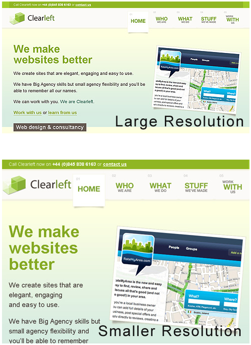
Elastic and fluid layouts are incredibly similar in appearance, so much so that they are usually confused with each other. However, elastic designs use em‘s instead of percentages and depend primarily on font size. These designs adjust to the text size that users set for their browser.
7. Which Is Right For Your Website?
Choosing between a fixed and fluid website will depend a lot on the type of website itself. Weigh the pros and cons above to determine the right solution for your website.
A portfolio website, for example, would probably be best shown in a fixed-width layout, so that you have more control over the design. Not only will you be able to better control the layout of individual elements in the design, but the images in your portfolio showcase will be better handled with a fixed width. Many designers, not just those with portfolios, may prefer fixed-width layouts for the ease of use and assurance it gives them.
Any designer who seeks 100% compatibility should take the time to set up a fluid layout. In such a case, the main challenge isn’t the excess of white space in large screen resolutions, but rather the small percentage of users with a small screen resolution. For websites with large audiences, accommodating even the smallest percentage of users may be important. But even beyond that, websites with large audiences should have a simple and clean design anyway, which can be done effectively with a fluid layout.
Still can’t decide? An elastic or partially elastic design is still an option. When used correctly, elastic layouts can bring the biggest benefits of both other types<. Designers will often employ the elastic-layout principle in using em‘s for fonts and containers, and then use a smart mix of percentages and pixel widths to set the rest of the layout elements.
Source: Fixed vs. Fluid vs. Elastic Layout: What’s The Right One For You?




Leave a Reply